
Pantone colors set a standard of color used in the design and production across the world, regardless of the location and production equipment. As the Pantone Color System is widely adopted by practitioners in various industries, here we’ll talk about what the Pantone color and the PMS system are, and also introduce differences between Pantone, CMYK, and RGB, how to find Pantone colors (Illustrator & Photoshop), and the Pantone Color of the Year updated in 2025.
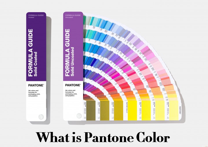
What is Pantone Color? – Pantone Matching System
PMS has different meanings in various industries. When we are talking about graphic design, PMS usually means Pantone Matching System, which is its full form. Pantone color refers to the color specified in this system. It is a standardized color-matching system that designers and printers use when there is a need to ensure color consistency. Within the Pantone Matching System, there are two main types of colors: solid colors and process colors.
Solid colors, also known as spot colors, represent the most accurate and pure form of color in printing. These colors are created by mixing inks to a precise formula and then applying them directly to the print surface. Because solid colors are pre-mixed, they deliver bold, vibrant, and highly consistent hues that closely match the designer’s original intent. Solid colors are often used in logos and brand colors where exact color matching is important. A total of 3,026 solid colors are available in PMS colors.
Another type – process colors are created using a combination of Cyan, Magenta, Yellow, and Black (CMYK). By layering these inks in varying proportions, printers can produce a broad spectrum of colors. This category is commonly used for full-color images and photographs where subtle shading and gradient effects are needed. Although process colors allow for a wide range of hues, they are generally less precise in color matching compared to solid colors. The Pantone Matching System includes 6,732 process colors.
In the Pantone Matching System, there are a ton of different colors. Every color in this book has a code and a name, and when you have your logo designed, your designer will specify a specific number for each Pantone that they use in the logo. PMS is a proprietary, standardized color system used in many sectors of the manufacturing industry, which describes colors by assigned numbers. By standardizing the colors, manufacturers in different locations can refer to the PMS and ensure the colors match efficiently, also avoiding color deviation between the design and finished parts.
Common Pantone Matching System:
- Formula Guide (Coated & Uncoated): one of the most commonly used Pantone color guides. It provides all the Pantone Spot Colors and their ink formulations; it’s a good tool whether you want to look for inspiration for your design or need to match colors as a supplier.
- Color Bridge (Coated & Uncoated): the only Pantone Tool that offers CMYK, HTML, and RGB values for Pantone Spot colors. It allows you to see what your spot color will look like if printed using a 4-color process.
- Extended Gamut (Coated): the latest development in process printing technology, with 90% better Pantone spot color matches over CMYK by adding Orange, Green, and Violet to the color gamut.
How to Find Pantone (PMS) Color in Adobe Illustrator?
PMS Color Matching System is so prevalent in modern visual culture that you can find it in Adobe Illustrator, which allows you to use Pantone colors for color consistency. Here are the steps for locating Pantone color in Adobe Illustrator:
1. Open your Illustrator, select “Window” > “Swatches” to open the Swatches panel. By default, you should only see colors that fall within the CMYK range.
2. Click the drop-down arrow in the upper right corner of the Swatches panel, and choose “Select All Unused” from the list, then click the arrow again, choose “Delete Swatch” to remove unwanted CMYK colors. If you find some extra colors remain, you can delete them individually.
3. Select “Window” > “Swatches Library” > “Color Books”, click on the Pantone color guide you need among a large number of Pantone books, and add the Pantone swatches.
4. Then the Pantone swatches are added to your Swatches panel, and you can see new PMS color options there, organized by designated number.
5. To find a specific Pantone color, click the drop-down arrow in the upper right corner of the Pantone panel, and then select “Show Find Field” from the list. Then you can search for the color by entering the corresponding number.
Can I Find Pantone Color in Illustrator 2025?
No, you can’t find Pantone colors directly in Adobe Illustrator 2025 like before. Since October 2023, Adobe has removed the Pantone Color Books from Illustrator. This change means the usual easy way to pick Pantone colors inside the software no longer works. Adobe ended its built-in Pantone libraries due to changes in licensing agreements with Pantone. As a result, Illustrator no longer includes those swatches, and the color conversion process has become more complicated.
How Can You Use Pantone Colors in 2025?
1. Pantone Connect Plugin
Pantone offers a separate plugin called Pantone Connect. You can install this plugin for Illustrator, but many users find it limited or difficult to use. It requires logging in and sometimes does not integrate smoothly with the software’s color menus.
2. Manual Color Matching Using Pantone Books
If you have physical Pantone swatch books, you can look up the Pantone color codes manually. Then, create custom swatches in Illustrator by entering the color values yourself. This method relies on having the actual Pantone guides and can be accurate but a bit slower.
3. Use Alternative Pantone-like Palettes
Some artists and designers use free or alternative color palettes like FREETONE by Stuart Sem, which mimics Pantone colors and can be downloaded and imported into Illustrator. This method is a practical solution when Pantone Connect is not working well or you want an easier setup.
4. Older Illustrator Versions
Some users suggest installing an older version of Illustrator that still includes Pantone libraries, then copying those swatch files into the newer Illustrator version. However, this is not officially supported, may not work perfectly, and older versions might be unavailable through Adobe.
How to Find Pantone Colors in Photoshop (2025)?
1. Start by launching Photoshop and either creating a new document or opening an existing image where you want to use Pantone colors.
2. Click on the foreground color box located at the bottom of the toolbar; this action opens the Color Picker window.
3. Inside the Color Picker, click the “Color Libraries” button. From the dropdown menu labeled “Book,” choose one of the Pantone options such as “Pantone Solid Coated” or “Pantone Solid Uncoated.”
4. You can scroll through the Pantone color list or quickly enter a specific Pantone number in the search bar to locate the exact color you need.
5. Once you find the desired Pantone color, click “OK” to set it as your foreground color in Photoshop.
You can also match an existing color to its closest Pantone equivalent; first, pick any color in the Color Picker by choosing from the color spectrum or entering RGB or CMYK values. After selecting your color, click the “Color Libraries” button, and Photoshop will automatically suggest the nearest Pantone color from the selected Pantone book. Click “OK” to accept the Pantone match as your new foreground color.
If you are using Photoshop 2025 or any version released after August 2022, you may not find Pantone color libraries because Adobe removed them from the software. To overcome this, you can use free online Pantone color converters by entering your RGB or HEX color codes; these tools will help you find the closest Pantone match manually.
Pantone vs CMYK vs RGB: What Are the Differences?
RGB is a color model based on light and used mainly for digital screens such as computers, phones, and TVs. It combines red, green, and blue light in different intensities to create a wide range of colors. Because it works with light, mixing colors in RGB produces lighter shades, and when all three colors are combined at full strength, the result is white light. However, RGB is not suitable for printing since printed colors rely on inks and pigments rather than light.
CMYK stands for Cyan, Magenta, Yellow, and Key (black), and it is the standard color model for printing. This system uses four ink colors that layer on paper to create a broad spectrum of colors. Unlike RGB, CMYK is a subtractive model, meaning that colors get darker as inks overlap and absorb light. It works well for photographs and detailed images, but can sometimes struggle to reproduce very bright or specific colors accurately.
Pantone colors are widely used in manufacturing and branding. Each Pantone color is a unique formula mixed from a set of base inks before printing, rather than being created by layering dots as in CMYK. This method allows Pantone to achieve colors that CMYK cannot reproduce easily, including vibrant, metallic, or very specific brand colors.
RGB vs CMYK vs Pantone
- When comparing color range, CMYK offers a wide variety of colors, but cannot reach some bright and special shades that Pantone colors can provide. Pantone colors are pre-mixed blends that guarantee accuracy and consistency, which is important for maintaining a brand’s identity. On the other hand, RGB covers the largest color range but only on digital displays, not in print.
- Regarding color consistency, Pantone colors provide reliable and repeatable results across different print runs and materials because each color is standardized by code. CMYK colors can vary depending on the printer, ink quality, paper type, and calibration, which sometimes causes slight color shifts. RGB colors also vary across different screens and devices, so they are not dependable for exact color matching.
- In terms of printing techniques, CMYK is used for the most common printing jobs, such as digital and offset printing, offering a cost-effective solution especially for large print runs. Pantone colors are typically used in offset printing, where specific inks are mixed to produce exact shades, which can be more expensive but worth it for high-accuracy needs. RGB is not used for printing but is essential for anything viewed on screens.
- When it comes to use cases, CMYK is best suited for printing full-color images like photographs or complex designs where exact color matching is less critical. Pantone is the preferred choice for corporate branding, logos, and any project requiring precise and consistent colors, especially when colors must remain identical across different products and materials. RGB colors are ideal for digital content, including websites, apps, and videos.
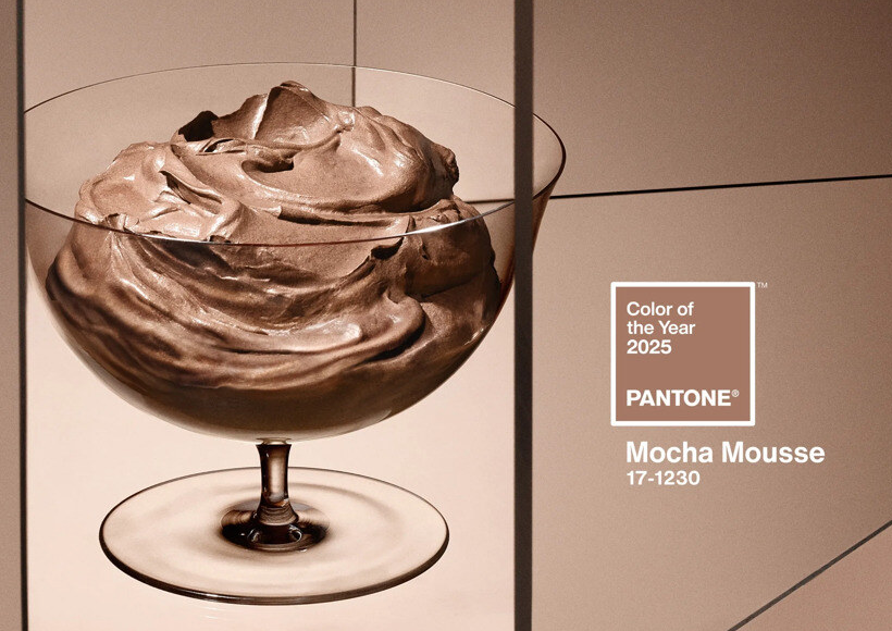
Pantone Color of the Year 2025: Mocha Mousse (PANTONE 17-1230)
Every year, Pantone chooses a color that captures the mood and attitude people share across the globe. For 2025, the chosen color is Mocha Mousse, a warm brown shade that brings a sense of comfort and richness. This color draws inspiration from the cozy qualities of chocolate and coffee, offering a soothing and grounded feeling.
This brown tone carries an earthy elegance. It works well alone or combined with other colors in many different styles, whether simple and clean or detailed and complex. Designers across fashion, interior decorating, graphic design, and product development can use Mocha Mousse to bring warmth and balance to their creations.
Related Articles:
 Best CNC Machines 2025 – Top 8 CNC Routers to Buy in 2025
 Best CNC Laser Engravers 2025: Top Budget & Industrial Laser Cutting Machines with Buying Guide
 3D Printing Filament Types, Sizes, Colors & Speed
 Best Drill Bit Sharpener 2025 – Top 10 Industrial Drill Bit Sharpening Machines
 What Software Affects 3D Printing – Netfab, Magics, Dyndrite & More
 What is Multi Jet Fusion & How It Work – HP MJF 3D Printing Principle, Benefits, Price, Applications